Thursday, November 28, 2013

Special Topics in Archaeology Final Project


For our final project in GIS5999, we were encouraged to come up with our own project and use many of the tools we've learned over the last year.  

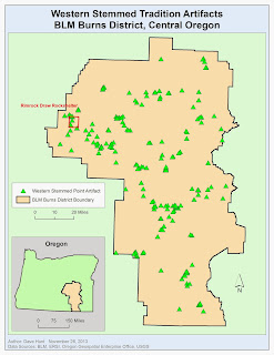
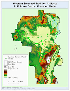
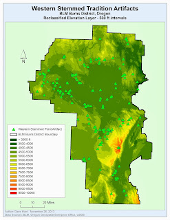
For many decades the first colonizers of the Americas were a group of people called the Clovis tradition.  This has been challenged in recent years by sites that are as old or older than known Clovis sites.  Recently, the Western Stemmed Tradition culture (refers to a style of lithic point) has been found to be as old or older than Clovis.  I was able to acquire the database of WST points for the Oregon Burns District of the Bureau of Land Management.  I've worked at a site in this district for the last couple summers and thought it would be interesting to expand upon this work.  Map 1 shows the distribution of known WST artifacts across the Burns District.
Map 1
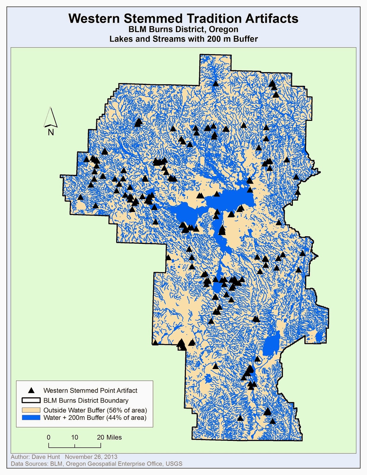
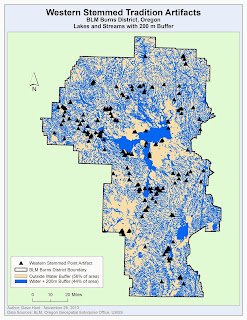
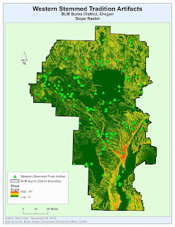
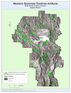
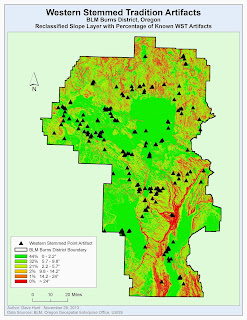
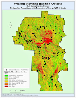
My project involves creating a predictive model.  A predictive model should help archaeologists plan future surveys by highlighting areas that are likely to produce more sites and save time by avoiding areas with low probability of producing sites.  My model will use proximity to water, elevation, slope, and aspect (direction towards the sun) to produce the predictive model.  Map 2 shows all the water features (lakes and streams) in the district with a 200 meter exterior buffer. Map 3 shows the elevation model for the district.  Map 4 is a slope raster produced from the DEM.  And, Map 5 is an aspect raster also produced from the DEM.
Map 2
Map 3


Map 4
Map 5


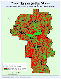
For this predictive model, I had the advantage of having the database of locations for 414 known WST artifacts.  Using this information, I was able to use an ArcMap tool (Extract Values to Points) to determine how artifacts were grouped within each component.  For example, for elevation, I created a layer divided into intervals of 500 feet each (i.e., 4000 - 4500, 4500 - 5000, etc.). Then, using the Extract Values to Points tool, I could determine how many artifacts fell into which interval. From this information, I could determine the percentage of artifacts in each class and Reclassify the raster to hold that value.  Map 6 is the water buffer map reclassified to show that 63% of artifacts occur within 200m of water while 37% of artifacts occur outside that buffer.  Map 7 is the reclassified elevation map, showing that most WST artifacts occur between 4000 and 5500 feet.  Map 8 is the reclassified slope map, showing that most WST artifacts occur on flatter terrain.  Map 9 is the reclassified slope map showing that, surprisingly, most WST artifacts occur in a Northerly aspect.
Map 6
Map 7
Map 8
Map 9
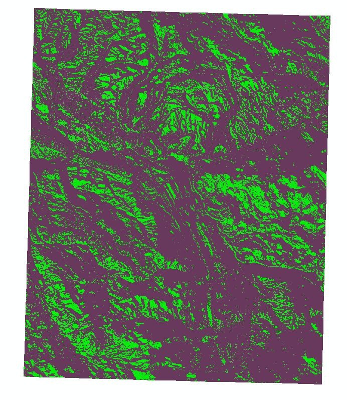
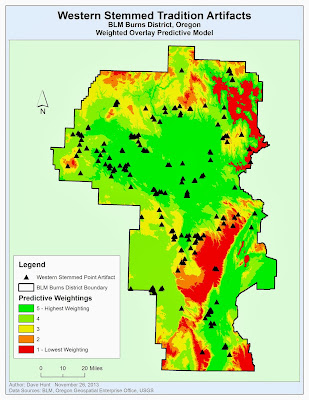
The Weighted Overlay tool in ArcMap allows us to assign relative values then to each of these rasters and combine them, based on that value and the reclassified values within them, into a single "weighted" raster.  This combination should provide a whole, more useful than its parts, that can be used to determine which areas are more likely to yield further WST sites.  Map 10 is the final weighted overlay from this analysis. Green areas a good areas to conduct further survey research, red are likely poor areas.  

Map 10
Overall, I was a little disappointed with the generalized look of this predictive model.  In the future, I would like to refine it and hopefully tighten up the areas that are most highly weighted. 

In addition to the weighted overlay, I was curious about producing a density map based on known WST artifacts.  This is shown in Map 11.  This map also includes an aerial image of the center of the densest region.  Looking at the aerial, we can see that, in fact, many of the artifacts in this densest region are on the shores of dry lakes.  One area that might help tighten the predictive model is to just use the lakes features and exclude streams.  Streams (and 200m buffers around them) consume an enormous area of the map and perhaps WST people were more inclined to live along lake shores than stream banks.  This is an area I will research further.
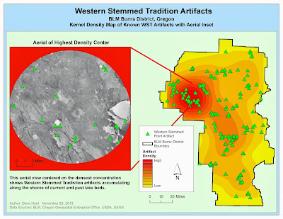
Map 11
Finally, for the graduate student requirement, we conducted some statistical tests on our results.  Map 12 shows the result of a Hot Spot analysis following an Ordinary Least Squares analysis.  The red dots indicate areas where more WST artifacts are occurring than would be expected.  I found it encouraging that my field work is occurring near the red dots in the western-most portion of Map 12.
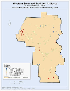
Map 12
Overall this was a pretty intense final lab.  It was a lot of work, but I think the results are useful or will be useful with some further refining.  I am optimistic that we may find some interesting patterns regarding where Western Stemmed Tradition people congregated on the landscape and this may be useful as part of the pursuit for determining who was first in the Americas.


Thursday, November 7, 2013

Biscayne Bay Shipwrecks - Weighted Overlay


This week we continued with our project focused on Biscayne Bay shipwrecks. We began by creating 300 meter buffers around our 5 known shipwrecks to help us understand the benthic bottom types (for example consolidated sediments vs. reef terraces).  These various bottom types are shown in the map above.


The second map takes the benthic bottom and bathymetric layers we created last week and converted them to reclassified layers.  For the benthic bottom types, we grouped various bottom types into 5 classes that have increasing likelihood of shipwrecks (this from external known data).  For the bathymetric layer, we used natural breaks to create 5 groups representing the depths of the areas.  These two reclassified layers are shows above.


The final step was combining these two reclassified layers into one layer.  In doing this, we also wanted to weight one layer more highly than the other (70% benthic bottom type, 30% bathymetric). In doing this, we're saying that we think the benthic bottom type is a better indicator of where shipwrecks might occur.  The final product is the map above, with areas in red indicating areas that we may want to survey in the future to locate more shipwrecks.

Tuesday, November 5, 2013

Supervised Classification

Supervised Classification using Bands 4, 5, and 6
The final regular season lab for Remote Sensing was a supervised classification of a developing city (Germantown in Maryland).  We began with an aerial image of the town along with coordinates for 12 known land cover types.  After locating these points in the image, I used the technique of growing spectral signatures from a seed.  This involves setting a Spectral Euclidean Distance (mostly an estimate at first) and letting ERDAS Imagine build a polygon of pixels starting at the point you designate and emanating out to the spectral distance you selected.  This produces very interesting results and it is both fun and useful to play a bit with the distance to get the best signature of the known terrain.

Once the signatures are complete, it is important to verify that there is no spectral confusion (overlap) between signatures.  I found the widest separation in the signatures was found in Bands 4, 5, and 6, so I used these bands to create the supervised image.  I also merged the like signatures (we had multiple signatures for the same land cover, like "agriculture") into single classifications. Creating a set of classes also allows one to estimate the area dedicated i the image to each class.  The final supervised classification is presented above.

Sunday, November 3, 2013

Biscayne Bay Shipwrecks - Part 1


This week begins with the first of a three-part lab involving GIS and shipwrecks!  I am super excited about this lab as this is exactly the reason I signed up for the GIS Certificate program at UWF in the first place.  The first part of this lab is about collecting the data we'll need for later stages of the lab.  We were provided a modern-day nautical chart (left) of Biscayne Bay National Park and the locations of five shipwrecks along the Maritime Heritage Trail (an underwater trail!).  We then had to locate an historical map (center) and the bathymetry data (right, in the form of a digital elevation model) for the park. From this maps, we get a sense of the conditions that led to these ships coming to grief in this particular part of the Florida Keys.

Thursday, October 31, 2013

Unsupervised Classification

Unsupervised Classification of the UWF Campus
This week in Remote Sensing we used an aerial image of the UWF campus to try some unsupervised classification techniques.  Unsupervised classification is when we rely on the computer to group like pixels together and make assumptions that these represent similar features.  In the image above, we started by using ERDAS Imagine tools to create 50 unsupervised classes.  Then I manually assigned these 50 classes to 5 categories (Buildings/Roads, Trees, Grass, Shadows, and Mixed).  This process actually is pretty easy and goes quickly with the ERDAS tools.  This was one of the first assignments where I felt like the ERDAS tools were easier to use for this task than a similar task in ArcMap.  From the 5 new classifications, I was able to create an estimate of the permeable versus impermeable surfaces that make up the UWF campus.

Sunday, October 27, 2013

GIS Internship - Article Review

Review of Mapping Benthic Habitats; the Marine GIS Challengby Joe Breman
ArcUser Online, Spring 2005

In Mapping Benthic Habitats; the Marine GIS Challenge, the author offers an outline of the challenges of both modeling the ocean floor and then making important conservation decisions with that model.  I chose this topic as it covers several areas of interest to me personally.  I am a recent UWF Maritime Studies graduate, so I have a strong interest in the ocean and all things maritime.  I am also a current UWF GIS Certificate student and this topic covers the use of various GIS tool in the process of mapping the ocean floor.   Finally, I am an avid SCUBA diver and have a strong interest in conservation of ocean resources and wildlife and the end result of this study is a better understanding of the areas we need to conserve.

The article primarily discusses two types of GIS tools.  The author notes that there is an extensive database of benthic sensor data.  We have been taking sonar readings and scans of many parts of the US coast for decades and this provides a rich set of data to be utilized.  Most of the data is simple x, y, and z point data and is easily converted to surfaces using tools readily available in ArcMap such as  the Inverse Distance Weighting, Spline or Terrain Dataset tools.  Once the surface is created, 3D Analyst can be used to visualize the ocean floor and assign a “bottom type” to each cell in the model.  These types are then used in mapping out habitat regions that need to be conserved for different species.  Making this process all the more complicated is that some species spend different portions of their lives (i.e., juvenile and adult) in differing habitat types.

Overall the report was informative, albeit rather brief.  I am especially interested in 3D modeling and wish that we had an entire separate class on it as part of the GIS Certificate.  I would like to continue on in my own studies and expand my skill set using 3D modeling.  I am also glad to see GIS tools being used effectively for conservation and, hopefully, improving or minimizing our human impact on some of these areas that are often “out of sight, out of mind” for most of the general public.

Saturday, October 26, 2013

Scythian Mounds, Final Report


The final lab for the Scythian mounds project involved creating the final predictive results based on our previous work.

Using these surfaces, we created a feature class of random points (minimum 30 m spacing) throughout the study area and merged these points with the possible mounds identified from an aerial image.  This feature class was then expanded with fields and filled with the values from the reclassified surfaces (elevation, aspect, and slope).  These points were then subjected to an Ordinary Least Squares linear regression method based on these three surfaces (top map above).

The results of the OLS give the following results:

               Adjusted R-Squared:   0.760202


Coefficient
Probability
Intercept
-1.770434
0.000000
Aspect
0.115368
0.000001
Slope
0.113834
0.000001
Elevation
0.630913
0.000000

The Adjusted R-Squared value of 0.760 suggests that the three surface variables can explain 76.0% of the sites in the predictive model.

Since the coefficient values are positive (with the exception of Intercept) and not very close to zero, it appears that each surface property is making a positive contributing to the model results (with our reclassified weightings).  The probability values < 0.05 also support this conclusion (near 100% confidence level for each coefficient).

We also subjected our OLS results to a spatial autocorrelation test, returning the following results:

z-score: 11.43385
p-value: 0

The very low (zero) p value indicates that it is very unlikely that the data is distributed randomly.  The high Z-score (in conjunction with the low p value) indicates that the data is normally distributed and spatially autocorrelated.

Based on a visual review of the OLS residuals and hot spot analysis, it does appear that many of the predicted areas are within valley bottoms.  It may be beneficial to add an additional variable that accounts for this spatial distribution, such as access to water in the form of rivers and streams.


It does appear that we have established that the variables in use are helpful for use in a predictive model. Per the lab, it would probably be a good idea to test these variables further with a larger point set and additional regression models (such as GWR).  Additionally the variables should be analyzed further to ensure the relationships are truly linear.  Adding additional variables (such as access to water) may also expose additional relationships.  Finally, any model should be subjected to some ground truthing to understand if it is truly useful.

Tuesday, October 22, 2013

Thermal Imagery and Analysis

Thermal Imagery using ETM+ Thermal and TM True Color

This week in Remote Sensing, we focused on Thermal Imagery.  Thermal imagery has all sorts of uses, from military to environmental.  I chose an environmental perspective for this lab project.

I started by creating ETMcomposite.img, a combination of 8 ETM images using ArcMap’s Composite Bands tool.  I wanted to work directly with the thermal band, so I started out with just band 6 of ETMcomposite selected.  I selected a color ramp that intuitively matches what we expect for cool to warm colors (blue to red).  By adjusting the Symbology/ Histogram breakpoints, I was able to accentuate the range of values in the overall image, really increasing the contrast between warm and cool areas.  This is really when I noticed Santay Island for the first time.  It was so cool (as in cold) in the middle of this large urban area and really not very far away physically.  It seemed to make a good ecological point that these small refuges can exist within urban areas if we take care of them.  Unfortunately, it looks like someone is already clear cutting in the middle of the island and that can be seen clearly in the thermal image.

Tuesday, October 15, 2013

Multispectral Analysis


This week in Remote Sensing we experimented with multispectral analysis.  Using a LandSat image of western Washington state (my home state!), we attempted to determine what features were causing various spikes on histogram representations of the image.  In the first image, there was a prominent spike at the dark side of Band 4, indicating to me that this must represent all the water in the arms of Puget Sound.  I used TM False Natural Color to best present the water feature.


In the second image, we had smaller spikes in the bright end of the histogram.  This appears to be the snow on the peaks of the Olympic range.  True Color seemed the best representation for white snow.


Finally, some bodies of water appeared lighter and brighter than others. I captured this in the bottom map of Grays Harbor.  We can see that either a lot of sediment or algae is making this image appear lighter.  TM False Color IR really helps this brighter feature stand out in this image.


Saturday, October 12, 2013

Scythian Landscape - Analysis


This week we began our analysis of the landscape around the Scythian mounds at Tuekta.  This consisted primarily of running reclassification operations on various landscape attributes.  The first map (top left) is a simple contour map of the study area.  This gives us a general idea of the elevation where the mounds are found.  The second map (top right) is a reclassification of the slope.  Using this map, we can determine (not at this scale) that the mound areas generally have a slope in the range of 0 - 9.3° (in dark green). This will provide a good guide in the future on areas that might have undiscovered mounds.  The next map (middle left) is a reclassification of the elevation.  From this map, we can determine area that are in a similar elevation band as the known mounds.  The middle right map shows reclassified aspect.  This map shows the directional exposure of the area.  The areas that have a mostly southern exposure (towards sunlight) are highlighted in light blue.  Finally, the bottom image shows my guesses at mounds (some obvious, others not so much) based on an aerial view of the Tuekta area.  These are areas that we may want to explore further.

Friday, October 11, 2013

Spatial Enhancements


This week we experimented with spatial enhancements on some imagery.  The original image was a panchromatic layer that exhibited pretty distinct banding.  Through the use of a Fourier transform and some experimentation with different convolutions, I was able to produce the image above.  This image attempts to minimize banding while finding a happy medium between being too generalized (low pass convolution) and too "edgy" (high pass convolution).  In the end, the banding is generalized so it is not distracting and the urban features remain relatively sharp and distinct.

Thursday, October 3, 2013

Modeling Scythian Landscapes - Part 1


This week we were largely in preparation mode as we start into a module on Modeling Scythian Landscapes.  I am excited for this module as I am particularly interested in landscape archaeology and have been looking forward to attempting to model landscape concepts in GIS.  In the map above, we've created a mosaic of ASTER images as the DEM background for our study area.  In the inset is an aerial view of the mounds that has been georectified to the basemap.  This was all a pretty straightforward process, so we should be good to go for Parts 2 and 3.

Monday, September 23, 2013

Intro to ERDAS Imagine


This week in Remote Sensing we were introduced to ERDAS Imagine.  ERDAS Imagine is a geospatial image processing application.  We started out with a pretty simple introduction to the application's menus and functions, working with an existing raster and creating a new raster from a subset selection.  The simple navigation and manipulations we did today were fairly easy, we'll see what comes next.  For the final product (above) we had to move back to ArcGIS to create our map.

I'll be honest, I'm not super excited about jumping into a new, complicated, and apparently buggy tool this late in the program.  I feel like we were just getting to the good stuff in ArcGIS and I'd much rather come away feeling like we plumbed the depths there.  Hopefully the pay-off will be worth this detour.

Predictive Modeling


This week in Special Topics in Archaeology, we had a pretty interesting lab exercise.  We started with a digital elevation model of the Tangle Lakes Archaeological District in Alaska and some hydrographic information (mostly about the streams and ice mass).  From this raster and features, we were able to create additional raster that indicated favorable slope (for living areas), favorable access to sunlight (more south facing), elevations below the ice mass (warmer), and areas that were within 0.5 miles of a water source (one of the many streams).

With all this information, we could combine all the rasters using a weighting for each into a single weighted overlay (above).  This map shows the areas that are most likely to be inhabited in green and least likely in red. While this was a pretty simple view of this study area, it was a good demonstration of the tools we need to conduct a similar study in the regions of our own archaeological study.

Sunday, September 22, 2013

Ground Truthing


Our Remote Sensing lab this week focused on accuracy and ground truthing the classification that we made last week.  We started with our existing LULC classifications and then created a set of sample points.  I recalled an ArcGIS function that creates a fishnet grid over a map and decided to try that as a means to implement systematic sampling.  When the grid was created (as a polyline) ArcGIS also created a set of points in the center of each cell as a separate shapefile.  This, it turns out, was perfect for what I needed as a largely random set of sample points.  I then used Google Street View to zoom in and verify that each point was indeed of the classification that I had assigned.

I ended up with about 90% success and 10% mis-classifications.  The bad classifications tended to be the Industrial areas (not so industrial).  Overall, I think it went pretty well, however and showed that we can pretty well discern the land use classifications of an urban area.

Friday, September 20, 2013

Identifying Maya Periods, Part III + Angkor Wat


For the final week of our Maya Pyramids project, we focused on tools that allow us to share our ArcGIS maps on Google Earth.  We created .kmz files that captured our potential pyramids sites, some of our map views of the sites, and our final map of potential sites (above).


The graduate students completed a "bonus" section creating similar composite views (NDVI in my case) for Angkor Wat which were then used to train and create a supervised classification.  My final classification is above.

The Angkor Wat site seemed fairly "trainable" though I did run into some initial problems.  Apparently it is quite cloudy at the site.  My first download (very large, as we know) of Landsat images ended up covering the site completely.  The second set of images from an earlier date, which is what I used, still had a fair amount of cloud cover, but I was able to work around it.

The site seems to contain a lot of canals and ponds.  These are highlighted quite well by a False Color and especially by the NDVI view.The Supervised Classification, however, seems to not be able to recognize the water (and it is strangely classified as "Urban").  However, the linear nature of the canals and various man-made structures is still obvious. 

The linear indicators helps highlight the extensiveness of the site beyond the monumental core. The site seems to extend at least as far east as it does west (far left of the large rectangular pond).  Similarly, the site seems to extend north and south about the same distance as the height of the central square region.  I'm not sure the Supervised Classification provided a better view of the nature of the site as the plain False Color and NDVI images similarly expose the extent of the site.

Thursday, September 19, 2013

Identifying Mayan Pyramids: Data Analysis


We continued with our attempt to discover Mayan pyramids in the Guatemalan jungle using Landsat images.  This involved using NDVI (Normalized Difference Vegetation Index) and also mixing some of the Landsat bands to try to find a combination that allowed us to identify a pattern we could use for searching for additional pyramids.  Once we identified a pattern (not so easy, more below) we would train ArcGIS to identify this pattern with pyramids and analyze the entire 4-5-1 band composite for us.

This was a difficult lab for a couple reasons.  First, ArcGIS just seems to have some inherent performance bugs when dealing with the raster operations for these large files.  I have a fairly high-performance computer and it really came to a crawl in a few instances (restart/reboot sorts of instances).  Second, the known Mayan pyramids that we were looking at were never more than mere smudges on the (fairly) low resolution Landsat images.  I could see the Mirador pyramids in the ERSE imagery basemap but really couldn't see anything definitive in the Landsat images regardless of the processing we put it through.

Overall, I liked the idea of the lab and I think it could be used to good effect if we had higher resolution images to manipulate and train.

Remote Sensing Mayan Pyramids: Week 1


For our first few assignments in Special Topics in Archaeology, we are doing something pretty cool - we'll be analyzing Landsat imagery to explore for Mayan pyramids in the Guatemalan jungle.  We began experimenting with and combining various bands from the 8 bands available from Landsat.  The different combinations each have different advantages.  The image above shows three of the possibilities. Landsat Band 8 provides the highest resolution of the Landsat bands (15m panchromatic). Natural Color combines the visual spectrum bands (Landsat Bands 1 - 3) and includes pansharpening (using Band 8).  False Color combines the green and blue spectrum (Bands 2 and 3) with the Near Infrared (Band 4) to highlight biomass.

We still don't have a great view of the pyramid at Mirador, but we will continue to home in on it in the following weeks.

Wednesday, September 18, 2013

LULC Analysis


This week's assignment in Remote Sensing focused on land use/land cover analysis of an aerial photo.  Our job was to analysis apparent land use and classify it according to a USGS two-level classification code.

The map seems to have two main “super-areas” – the bay and the urban land.  I began by creating a polygon for the whole bay (the shore and frame edges).  I then created a series of polygons for the wetland islands.  Later I would “erase” the bay with the islands to create a shapefile that was just the water areas of the bay (avoiding polygon overlap).

In the urban region, I began by identifying “natural” areas like the rivers, estuaries, lakes, and small forested areas. There didn’t seem to be any agricultural areas in this photo. These natural areas were pretty easy to identify, though I could see some difference of opinion on forest types and various classifications of wetland, estuary, and streams.  Similar to how the islands were handled in the bay, the deciduous forest was “unioned” and then the lakes “erased” so that the forest and lake polygons wouldn’t overlap.

Next, I started classifying the urban areas.  Several of these were quite easy to identify after the lecture and text descriptions – industrial areas, schools, and retail areas.  I was also quite happy to recognize the cemetery in the lower right.   The most difficult was the area I classified as “Commercial and Services” region that borders the highway.  There is quite a mix in there and some may even be residential.

Finally, everything that wasn’t otherwise classified in the Urban region, I deemed “Residential”. This is all the single residence housing that fills the urban region. To create this region I used the Urban Land polygon and “erased” a union of all the urban classified sub-regions out of it.

Tuesday, September 17, 2013

Visual Interpretation


For our first Remote Sensing lab assignment, we began with the basics of the visual interpretation of aerial photographs. In our first exercise, we simply identified regions in the image (above) that fall along a five-step scale in tone (light to dark colors) and texture (smooth to rough).  These two features (tone and texture) can help us understand what we are looking down on in aerial images.  In the image above, for example, the very smooth area (lower left, in blue) is water while a very "rough" area is the section of residential housing left of center.


The second part of the exercise had us identifying objects using one of several strategies: Shape & Size, Shadows, Patterns, or Association.  Some objects are quite obvious just by their shape and size.  I happen to be quite familiar with docks and piers, for example, and the pier in the image above was easy for me to identify by shape.  Similarly, the water tower may not be easily identifiable with only a top-down view, but the shadow is quite distinct to anyone who has ever lived in the mid-west.  The parking lot appears to have a distinctive herringbone pattern to it.  Finally, we can use association to identify features.  The beach is not particularly distinctive in this view.  However, we know we have water in the image (from the wave pattern) so the association of this feature adjacent to the water is easy to make.

Monday, August 5, 2013

Final Project


Our final project for GIS 5990 was a substantial research project.  I chose to continue with the Valley of Oaxaca data that we had used in the Digitization module.  An important anthropological question is whether there is a relationship between population intensity, limitations on the carrying capacity of the land, and a resultant emergence of government. One way to study this relationship is with “site catchment analysis” (Vita-Finzi and Higgs 1970:5) which can be used to determine whether the carrying capacity (the ability of the land to produce food) is exceeded in later cultural phases as populations expand.

The project involved determining the site catchment buffer for the archaeological sites in several 4km square grids within the valley.  In the image above, I've created 1 km buffers around the Phase IIIA site for my grids.  The sites have been converted to points, allowing me to create Thiessen polygons around each point.  Thiessen polygons allow us to divide up an area so that each point on the map is within a region closest to one of the site points.  This helps prevent double counting of territory.

With the catchment buffer established, and with the help of land cover shapefiles we had built earlier, I was able to determine how many hectares of each type of land/soil were within the catchment area for each site.  This could then be used, along with some information from the literature about corn cob lengths during the various phases and resultant crop yields, to determine the number of metric tons of corn grown around each site.  Assuming that a family of five could live on a metric ton of maize for a year, we can estimate the highest possible population supported by the catchment buffer.

In the end, my results showed that the catchment return was quite high and that agricultural limitations do not appear to factor into either settlement patterns nor provide support for the emergence of government in later cultural phases within the Valley of Oaxaca.

Friday, August 2, 2013

Sharing Tools


Our final assignment involved updating a script and creating a toolbox with an embedded script.  We modified an existing script to use the sys.argv arguments instead of GetParameters. We also added descriptive help text and finally embedded the script securely within the tool (with a password). The end result was a tool that can be shared as one file, reducing management issues for users.

A good finale to the class as we will, hopefully, expand on our Python and ArcGIS skills and be prepared to create new tools and share them with the ArcGIS community.

Thanks for the class!  I learned a lot.  I'm mostly interested in GIS from a landscape archaeology point-of-view, so learning various ways to automate geoprocessing and working rasters will likely have a strong presence in my future.

Friday, July 26, 2013

Creating Custom Tools


Pretty easy (if you do the exercises) and useful lab this week.  We took an existing script that will clip multiple input files and turned it into an ArcGIS tool.  First we created a toolbox in ArcCatalog and added a new script tool to the toolbox.  Then we associated the tool with our existing script.  We needed to make a couple modifications to the script to connect the tool's input fields with inputs that the script needed.  Finally we modified the script's print messages into arcpy.AddMessage() so the messages would appear in the dialog's own message space.

Overall, pretty quick but a good basis for how to make ArcGIS custom tools in the future.

Wednesday, July 17, 2013

Debugging and Error Handling


This week's assignment covered debugging and error handling.  This is a topic that is useful in any form of programming, not just when writing GIS scripts.  Our first exercise (above) involved correcting some syntax errors in a simple script that reads out the names of various airports in a shapefile.  Nothing too difficult here and the IDE that I use (PyCharm) helps point out many of those errors.


The second part of the assignment similarly needed corrections.  This script used some of the functions we learned last week in the Map Scripting module, so it was interesting to try to find the syntax errors in that code which we've not used much.


Finally, the grads had the chance to implement a couple try-except statements on code that contained errors. We didn't fix the errors, but implemented the try-excepts so that the code would still run, even if it ran into a problem.  This is a super useful tool to have as the exception can return good information about the error and prevent things from running off the rails entirely.  

Overall, a good week, lots of useful tools for the toolkit.

Monday, July 15, 2013

Remote Sensing


This week's assignment focused on using remote sensing resources and raster classification (both unsupervised and supervised) methods in an attempt to locate unknown archaeological sites.  Our first attempt (above) was an "unsupervised" classification of land cover by the ArcGIS program.  Unsupervised means that the program basically tried to divide the region up into classes (we asked for 8 classes) based on the coloration of our aerial (which was gray-scale).  This led to a lot of errors and redundancy.  Specifically, water bodies (which seem to be quite green) and forest areas were frequently confused. In the same way, the mounds at Cahokia Mounds State Park, and specifically Monk's Mound, were classified along with field grass and roads and buildings.

In the second part of the assignment, we created a point shapefile and selected land cover around the map.  I added over 60 points and manually classified them as water, forest, fields, roads, buildings and mounds. Unfortunately, the results of this "supervised" classification were not much better than the unsupervised.  There was still a lot of redundancy and errors in areas with similar color (water/forests) and some areas (like residential areas) were classified as a mix of water and forest rather than building sites.  It was interesting to try these methods, but I'm doubtful on whether they can be effective for archaeological work.

Finally, the grads played around with chi-square tests.  This test is super useful and I've used it in classes in the past.  The key seems to be finding or setting up data in a way that allows the use of this test.  That is a tool that I want to be ready and able to use when analyzing field results.

Sunday, July 14, 2013

Geometry and Rasters


We're starting to get into the nuts and bolts of reading and writing feature classes now. Part 1 of the assignment this week involved reading out the components of a shapefile and writing those to a text file.  This was a pretty straightforward assignment, though there are some subtleties with getting the "parts" of the geometry out of the shapefile.

Part 2 involved working with rasters.  I really wish we had more time for this topic as I think I will be working with rasters a lot in the future and I feel like we are only scratching the surface here.  The goal was to read in a raster and then apply various raster functions (slope, aspect - with varying conditionals) to create a new raster based on the combination of temporary rasters.  The end result appears above.

Finally, for grad students, Part 3 involved reading in the "parts" that we originally wrote out to a text file in Part 1 and build a new feature class.  This was actually pretty challenging.  While my code works and appears to match the desired outcome, I'm not completely happy with it.  One thing I don't understand is why the rows in the attribute table do not match the order that they are read in (and the order of the OID that they had in the text file).  I imagine there is some sort of object referencing/ordering going on that is outside our control, but it is somewhat troubling not having that level of control.  Overall, a good assignment this week and exposed a lot of the power of arcpy and GIS programming.

Saturday, June 29, 2013

Week 6: Exploring and Manipulating Spatial Data


This week's assignment focused on exploring and manipulating spatial data.  We created a new geodatabase via our script and then populated it with feature classes created from existing shapefiles.  Then we were introduced to cursors.  We created a SearchCursor along with a snippet of SQL to find the cities that are county seats in the cities feature class.  Finally, we populated a dictionary with city:population key:value pairs derived from our county seat query.

All and all a pretty straightforward lab. The only thing that really hung me up was forgetting to delete the cursor (which locked the gdb and caused me to wonder why my env.overwriteOutput=True wasn't working).