Tuesday, April 30, 2013

GIS Final


The final project for Intro to GIS was an involved exercise where we acted as GIS analysts evaluating the proposed Bobwhite-Manatee Transmission Line project. Our job was to evaluate the impact of the project on the environment (specifically conservation lands and wetlands), the impact on people living in the area (homes and land parcels in proximity to the route), possible public safety concerns with regard to children's proximity to the power line (schools and daycares), and a cost estimate based on project length.

Overall, the technical aspects of the project were not too difficult. We had performed all the operations before in some form, so it was largely a reinforcement of previous skills. We did need to include a number of maps to illustrate our points and that probably took the most time.  On top of that, I found the most limiting aspect being that our presentation mode was PowerPoint.  PowerPoint is largely geared towards a "landscape" orientation model and our subject was very north/south oriented.  This resulted in rather small maps within PowerPoint.  I'm hopeful the necessary points were still communicated.


Thanks for the class everyone!

Cartography Final

The participation rates of high school students for each state aligned with the state’s SAT average, for 2009.  The data show participation rate in the SAT is low in the mid-west and heaviest on the East Coast.  High participation appears correlated with lower average scores


Our final cartography project involved presenting two sets of data on a single map.  The biggest challenge was to choose the best means to combine these two types of data in a way that meaningfully communicated the result. I chose a choropleth map of state participation rates as the base.  Then I added graduated symbols to represent the mean scores.  The biggest chore was dealing with all the labeling for the various combinations of large/small states and large/small symbols.  In the end, I'm pretty happy with the result, the colors, and the overall message that can be derived by studying the map.

Thanks for the class everyone!

Sunday, April 7, 2013

GeoReferencing


In the first map this week, we experimented with georeferencing images onto a map, using the ArcMap Control Points tool.  We also edited the building data features and attributes, adding the new gym building to an existing feature class of UWF buildings and the new Campus Lane.  Overall, a good exercise, however I got bogged down in the requirement to make the eagle's nest an inset map (makes more sense in context with the rest of campus, IMO) and figuring out how to include a base map from ESRI.  We had worked with map packages in Week 4, but not really in a scenario that involved importing them to ArcMap 10.0.  I tried about a half dozen approaches and I'm honestly not sure I could reproduce the steps that finally worked.  The lab could have been more clear in this regard and I suspect there will be a lot of discussion forum chatter on this topic.


The second part of the assignment involved viewing the campus in ArcScene and adding 3D features to the scene.  The final product is pretty neat, though it seems a bit pixelated when finally exported as a .jpg.

Google Earth


I'm a huge Google Earth fan, so this week's assignment was pretty fun.  We learned how to convert ArcGIS maps and layers to KML files that Google Earth can use. Above is an image of my population density map from last week's assignment layered onto Google Earth's map.  We have the ability to turn on and off individual layers and adjust transparency as well.  I found the way Google Earth handles the legend from ArcGIS a bit strange (only have 9 positions that we can place it in), but otherwise the conversion was pretty painless. Google Earth seems to manage the projection just fine.

The second part of the lesson was creating a Google Earth tour across southern Florida.  Overall, this was pretty straightforward, though Google Earth did seem to be a bit "erratic" with knowing when layers were turned on and off during the recording and playback of the tour.  I think I eventually got it working correctly, starting with the dot map on, turning off to zoom to the Miami area, back on while zooming to Tampa Bay, off when looking at St Pete and Tampa, and then back on for the finale.  Overall, fun and pretty easy, though it can be hard to smoothly move the camera around when looking at city details.  They need to add some sort of "steady cam" feature for us amateurs.

Saturday, April 6, 2013

Geocoding


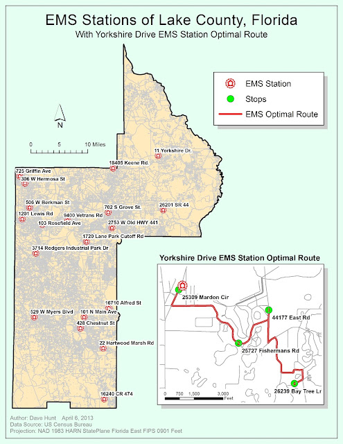
This week our task was to create a map that included a list of geocoded Emergency Medical Station (EMS) locations and to combine that map with an inset that included an optimal route from one of these stations to various neighborhood points.

I enjoyed this lab and it seems like we're really starting to get into the powerful features available in ArcGIS. In my map above, the larger county (Lake County, FL) map shows just the station locations.  I turned off the streets for much of the exercise as they really slowed down redrawing.  In the end, I preferred the clean look without the streets, but the lab said to include them.  I've tried to mute them and make the station labels stand out with a halo.  Unfortunately, if I made the label font bigger than 9pt, some station labels started to disappear (turned off due to collision, I guess).  I also looked to see if the roads were classified so that I could just show major roads, but the dataset we had to work with didn't differentiate between them.

I got to throw in a little Python programming in the inset map.  The labels for the stop addresses have the street address (i.e., 123 Maple Street) concatenated with the zipcode for some reason.  The label ends up looking like this:  123 Maple Street, 12345, which isn't too nice.   By right-clicking on the Route Stops / Properties, I selected the Labels tab.  Clicking on the Text String / Expressions button, I could enter this code:


def FindLabel ( [Name] ):
  mylist = [Name].split(',')
  return mylist[0]


... which basically splits the field label at the comma and then just returns the first element (just the Street).  This made much more usable Stop labels.

Friday, April 5, 2013

Dot Maps


This lab focused on creating dot maps.  This map shows the population densities of southern Florida according to data from the 2000 US Census.


The biggest challenge of this map was creating a color scheme that allowed for the varied elements while still allowing the population dots to remain prominent. I wanted to give the frame background color and spent a long time with both light and dark backgrounds. I ended up choosing a gradient light blue that seems visually pleasing.  I think the gradient helps avoid the implication that southern Florida is an island while still helping the main terrestrial area stand out.  I always struggle with what color to use for “land”.  In the end the combo of sandy color with blue for water features and green for wetlands works for me. I chose to diminish the color of the boundaries between counties but not to eliminate them entirely.  If I set them to No Color, the Keys are lost and we don’t want that.   Red might seem a bit extreme as a color for the population densities, but also seems to work pretty well with this color scheme.  Less bright colors tended to get lost in the sand/blue/green combo.

As a computer guy, I found it interesting how processor-intensive it was to generate the masks.  I have to wonder if there is an inefficiency going on there.  One would think it should not be much more than a couple clips joined together to move points from county boundaries into the urban areas that intersect the country boundaries.