This week in GIS4043 we explored ArcGIS Online and the use of map packages. This included using some of the prepared lessons on the ESRI website. The ESRI site looks like it will be a valuable website in the future for information and training in ArcGIS.
Map packages are similar to intelligent zip files. They allow the user to package up the essential components of an ArcGIS map collection and then share with others. In our exercise, we were able to post the packages up to our ESRI accounts where others see them. I could see this being a useful tool for sharing portions of a larger, group project (where everyone has different responsibilities) or just as being a way to find data that others have worked on that would be useful for my own projects.
The aspect of this lesson that was not clear to me is why we didn't include some of the map data, like the topography levels in the Aguirro Springs project. I understand that including the data would make the map package very large. However, I don't understand how a partial map package would be useful to another user. Is the assumption that they have access to the background data? Is this always a good assumption?
Wednesday, January 30, 2013
Tuesday, January 29, 2013
Intro to Illustrator

The goal this week was to export a map from ArcGIS format (.mxd) into Adobe Illustrator (.ai) where it could be further edited/manipulated and then exported as an image file (.jpg - seen above). This lab walked us through all the steps to accomplish this as well as detailed exercises in working with Illustrator objects, groups, and layers. It is especially important to make sure that ArcGIS objects (such as the scale bar and the geographic data) are grouped together into a common layer when working in Illustrator. This grouping will ensure that if any items in the group are resized, all the other objects in that group will stay within the relative scale relationship that existed in ArcGIS. Our lab also provided an overview of many of the most common tools in Illustrator for enhancing maps.
Sunday, January 27, 2013
Cartography
Population of Mexican States

This week we concentrated on applying cartographic skills to our maps. In this map that highlights the varying populations of the states of Mexico, I wanted to help the user focus on the essentials of the map. To this end, other countries are muted (gray). Even the North arrow and scale are somewhat muted (neither being particularly useful to the primary information set of this map). The legend will be important, so is level with the vertical height of Mexico. The color ramp for the map seems to work well, with darker colors indicating heavier populations.
Central Mexico :: Urban Areas and Transportation

This map of central Mexico allowed us to play with presenting a number of elements on the map. I'm pretty happy with the overall color scheme (even though color is not my thing...) but it still seems too busy to me.
Mexico Elevation Map

This elevation map was our first experience with a digital elevation model (DEM). I took an approach similar to that with the first map of muting regions outside of Mexico. Initially, I was using a color ramp with a single color, grading from dark (low elevation) to white (high ~= snow?). However, today I discovered two tone color ramps and I may be a true believer going forward. I was really happy with the ability to apply one color (like green) to low land areas and another color (brown in this case) to the high end of the elevation range.
Thursday, January 24, 2013
Data Classification
Combined Data Classification Methods

This week we focused on common methods of classifying and presenting data. Our first project presents four views of the African American population of Escambia County. Each of the methods used has different advantages and disadvantages, depending on the type of data and the spatial relationship that is being explored. These differences are easily seen when we apply different methods (quantile, natural breaks, equal interval, and standard deviation) to the same data and map. Since we were comparing methods for the same data and map, I thought it important to use the same color ramp for each map. This helps us compare the impact of the method better and not just be distracted by different color schemes.

Of the four methods used, I thought the quantile method seemed the best fit for the data. The quantile method breaks the total population up into classes (five in this example) of equal population size. So for a map of population density, each class represents a 20% increase (with five classes) in the subject population. This is an easy to understand distribution and presents a well graded map.
Wednesday, January 23, 2013
Own Your Map
UWF Location in Escambia County Map
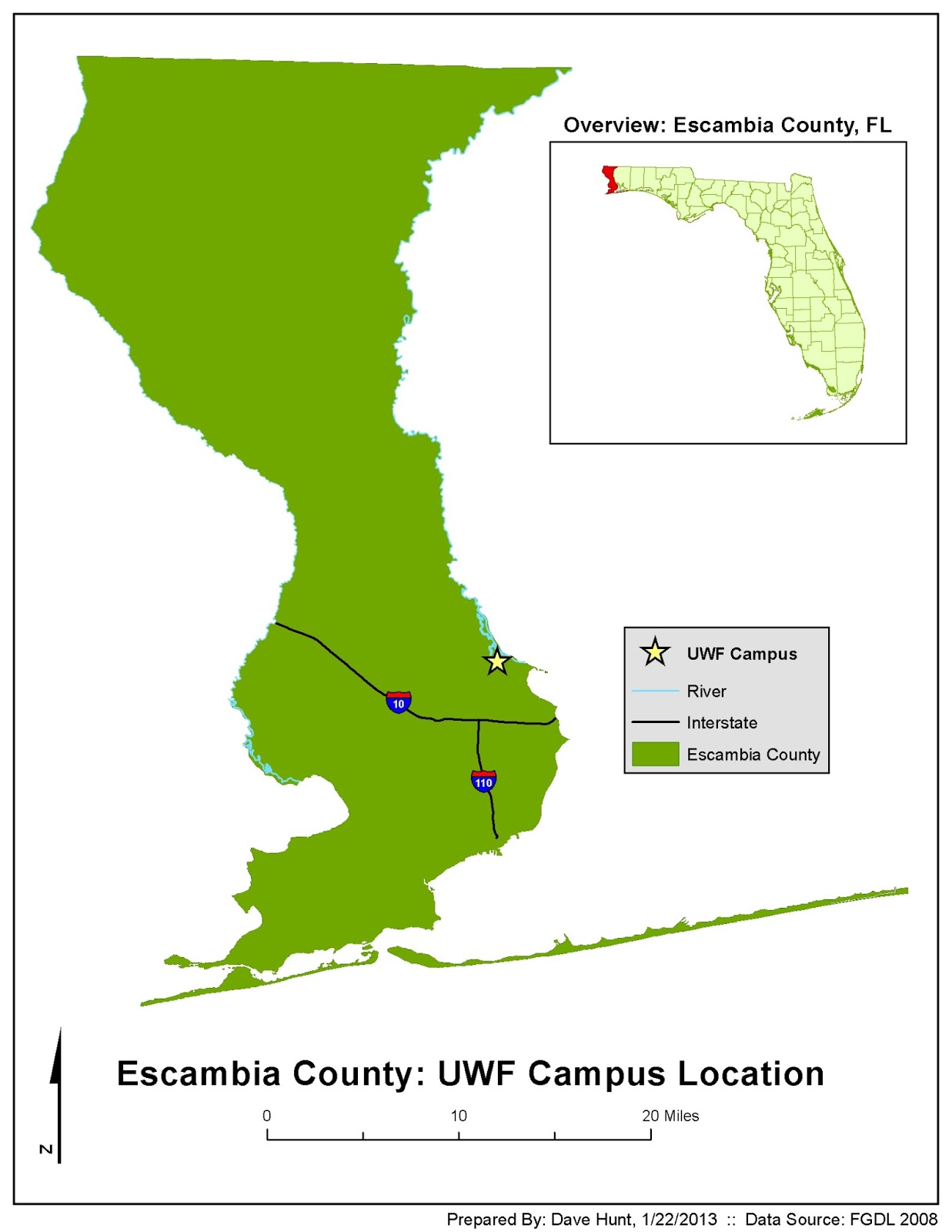
This week we practiced using the "essential elements" that we'll use on all maps going forward (legends, titles, scale, North arrow, border, name/date/source). We also learned useful functions like clipping one layer with another shapefile. I'm pretty happy with this map - I think it looks clean and the eye is drawn to the main point of the map (the location of UWF within Escambia County). Color choices will be a point of weakness for me in this course, so I'm trying to keep it pretty simple.
Wednesday, January 16, 2013
Statistical Foundations
Histogram with Custom Bins

This week in GIS3015 we concentrated on basic statistics and graphing. The histogram above (with trendline) demonstrates the use of custom "bins". In this case, we are using a custom bin size of 20, which presents a neat appearance on the horizontal axis and a better distribution (in my opinion) of the stock data. I've also edited the trendline axis on the right to remove a 120% increment (which doesn't make sense in this case) and cleaned up the labeling to only use whole numbers.
Saturday, January 12, 2013
ArcGIS Overview
ArcGIS Overview - World Map Exercise

Our first assignment in Intro to GIS involved presenting a world map highlighting country populations and major cities. We also added informational elements (legends, N indicators, scale bar, title and informational text) to the map. It was a good orientation to many common ArcGIS features.
Friday, January 11, 2013
Good Map / Bad Map
Good Map!

This is perhaps an interesting choice for my first “well-designed” map. This is from a “weekly specials” flyer for an electronics store called Video Only (VO) which has stores around the Seattle area (Bellevue and South Center are near Seattle). These maps are trying to do one thing and one thing only – help you get to the local store – and as such score high in Tufteian values of clarity and efficiency. They “know” you know the local area and are simply communicating major cross streets in relation to the major highways around Seattle (520, 405, and I-5). They also include just a couple clearly-labeled local landmarks, showing the stores’ relationships to these larger landmarks (Sears, Ross, Southcenter Mall) in ways that help orient the user. The maps are not particularly concerned with scale, but emphasize the routes the user will need and minimize visual clutter. As a local, I could easily find either of these stores.
Bad Map!

Reference:
Krygier, J., & Wood, D. (2005). Making maps: A visual guide to map design for GIS. New York: Guilford Press.
Subscribe to:
Posts (Atom)